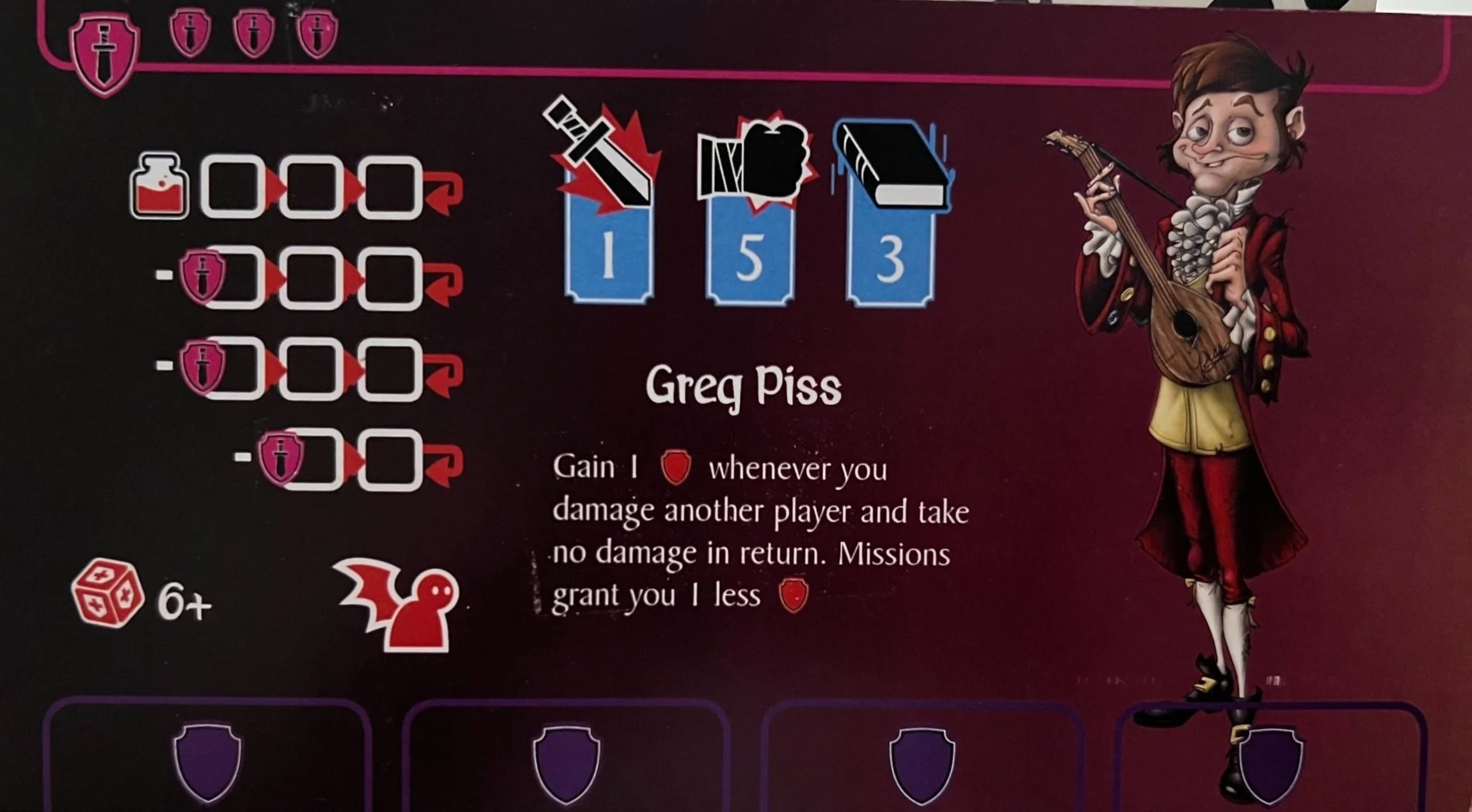
Evolution of a Player Board
There’s a lot wrong with this:
The health bar is confusing, there’s no differentiation between the three main icons as two are skill checks you roll and the other is damage you dish out. The confusion is only compounded when you get an item that does +1 dagger and +1 fist (that alone is maybe worth its own entry as it did lead to a sleep deprived minor mental break). There’s a random dice in the corner and a large gap of negative space between it and the alignment icon. There is no obvious link to health and items and on top of it all, it’s a bit boring.
Here’s the next iteration:
A bit better. Still not good. There is now a correlation between items and health, the font choice is bad, there’s still no clear differentiation between the skills and damage. It’s also very boring.
Now we’re getting somewhere! It’s interesting! Visually much better and the character doesn’t look like it’s floating on a gradient. But there’s still some problems. Mostly with iconography and once we sorted that, we were left with the finished player board.
Or so we thought. A friend of ours who works in video game design took a look at the above, tore it to shreds and offered this as a solution (as well as a detailed presentation on why he made those decisions).
The first change was with inventory and health. The correlation is clearer with each health section aligning with the inventory slot, it gives you the number of each character's health so at a glance you can see what everyone has. It’s tighter so there’s more real estate and it bookends with a skull and a heart instead of a health potion and nothing. The most controversial change was which way the health bar went, are you counting up or down? We settled on a countdown with full health being on the right but a lot of people had strong opinions on this one.
The next was looking at the action bar. We’ve gone from having a purple shield to a grey box with an arrow but what does that even mean? Instead these icons imply different times of the day which is helped by adding the number to each action so it’s clear where you’re up to. We still have grey to indicate an action and some of the nice art is removed to clear away the noise.
The last was looking at the skill checks. The dice are colour coded with the red attack linking to the red damage and the two symbols next to each other to indicate the correlation. The symbols are equal to or greater which didn’t work, neither did having the title but we liked the vertical alignment.
We took all of that on board and as of today, this is the finished player board.
Perfection?


